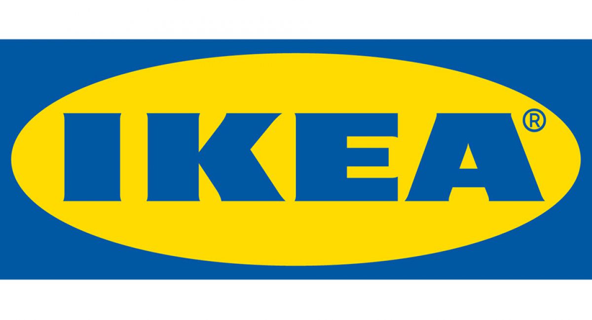
Ready to see IKEA’s new logo? Have you clicked straight through to this page expecting to see a radical redesign that repositions the famous Swedish brand? If so, sorry. We’re being a little cheeky. You’ve already seen the new IKEA logo. It’s at the top of this article. There it is, go on, take it in.
We won’t blame you if you don’t believe us. The new logo, designed by Joakim Jerring from Stockholm’s Seventy agency, isn’t exactly a huge departure from the previous IKEA logo, which had been going strong since 1992. In fact, if you were prompted to draw the IKEA logo from memory, you’d probably whip up something fairly similar to both that logo, and this shiny new one.
So, what’s changed with the new logo design? When compared with the old logo (below) perhaps the most obvious change is that the registered trademark symbol has been packed away into the recognisable yellow oval itself, rather than being left to float along side it.

Speaking of the oval, that’s had a growth spurt to accommodate the (slightly) bigger lettering. The flairs on said lettering have also been trimmed, which allows for tighter kerning. Meanwhile, the counter in the letter ‘A’ has been expanded, and the arms on the letter ‘K’ taper off into a more narrow point.
Other changes include the introduction of a different shade of blue and yellow. The new colouring appears more toned down and muted. This is a welcome change, as the previous design used a bold palette that was a little harsh on the eyes. And if you’ve ever had to traipse through the arrowed slalom that is IKEA, you’ll probably agree that the last thing you need is eye strain.
As far as logo redesigns go, yes, this is much of a muchness. And IKEA has got its work cut out if it wants to replace its branding with this subtle update. We had to check and double check to make sure we were talking about the correct version when putting this post together, so god help the designers who have to replace the logo in store and online.
Source: CreativeBloq

